Snapper Forms Upgrade
2024 • | Lead Product designer | Figma
Project summary
This project began as a UI refresh of Snapper’s webforms, but quickly became an opportunity to enhance usability, accessibility, and maintainability across the entire system. As Lead Product Designer, I led the transformation of multiple form experiences and introduced a scalable design system that streamlined development and improved the end-user experience.
Our goal was not just visual consistency — it was to enable smoother, more intuitive interactions while future-proofing Snapper’s digital forms.
The Challenge
The Tertiary Concession Application form didn’t align with the rest of Snapper’s webforms — visually or functionally. It had inconsistent layouts, was not fully accessible, and lacked the usability standards found in other forms. This created a disconnected experience for users and made the form harder to maintain and improve over time.
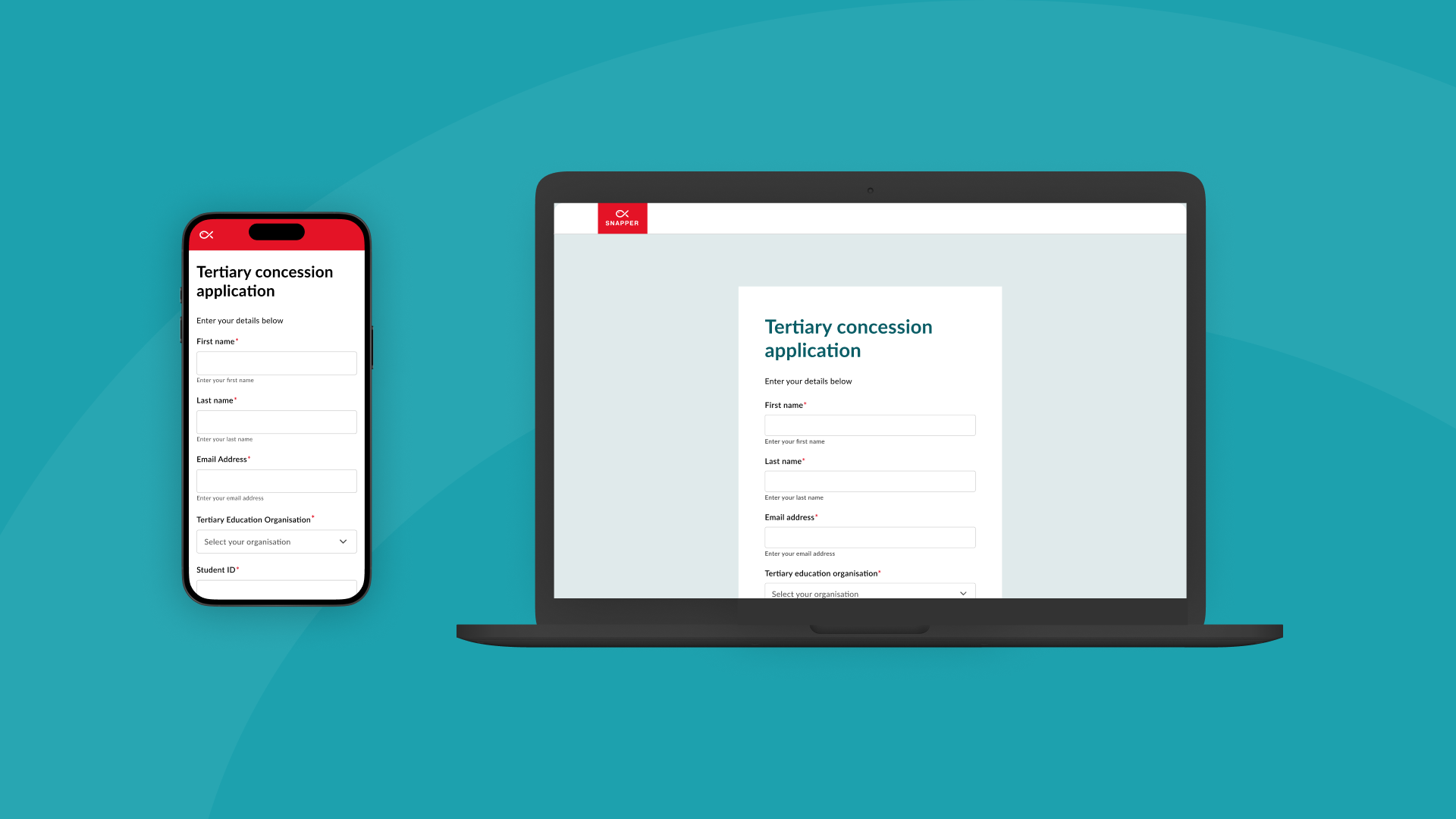
A key focus of this project was the Tertiary Concession Application form, which allows students to apply for discounted public transport using their tertiary ID. It’s a high-use form with a broad user base — including young adults accessing it on mobile — and plays a critical role in verifying eligibility for public transport concessions.
However, the form did not align visually or functionally with Snapper’s other webforms. It had:
Inconsistent layout and styling
Poor accessibility compliance
A frustrating mobile experience
No system in place to support future updates
This created friction for users — often leading to drop-offs — and added complexity for internal teams maintaining the form manually.
My role and responsibilities
As the Lead Product Designer, I was responsible for:
Auditing existing webforms for usability, accessibility, and visual consistency and security.
Created a modular, reusable design system that addressed layout, input patterns, and typography
Redesigning forms — including the Tertiary Concession form to align with the new system
Collaborating with developers to ensure feasibility and smooth implementation
Testing redesigned forms to ensure alignment with the intended experience and standards
Previous design

Design strategy
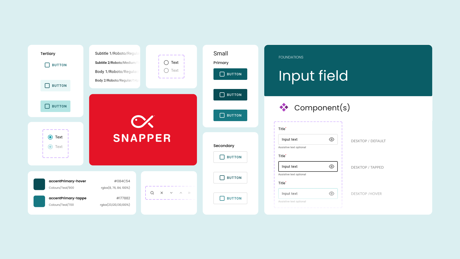
Design System Creation
Rather than solving issues form by form, I created a design system tailored to Snapper’s needs. This included:
Improved typography and colour usage for readability and brand alignment
Consistent input field styles, button behaviours, and form feedback states
A layout structure that scaled from desktop to mobile with ease
Guidelines and Figma components that made it easy for teams to maintain and apply the
system going forward
Redesign of the Tertiary Concession Form
Key improvements included:
A cleaner, clearer layout that simplified information entry
Mobile-first responsiveness, ensuring usability across devices
Enhanced accessibility features, such as properly labelled fields and logical tab orders
A consistent visual and interaction pattern with the broader Snapper experience
Design system elements
Introducing updated form design

Impact
Improved access for thousands of students applying for transport discounts
Increased mobile usability, particularly important for a digitally native audience
Accessibility upgrades ensured compliance and inclusion across devices and abilities
Visual and functional consistency across webforms reduced confusion and support needs
Reusable design system components accelerated development and reduced redundancy
Reflections & What’s Next
What I’d do differently
The design system solved the immediate problems, but looking back, I’d spend more time planning how it would be maintained over the long term. A clearer process for updates would help keep everything consistent as things evolve.
Opportunities Ahead
Try lightweight usability testing to see how different people interact with the forms
Grow the design system to support more of Snapper’s digital products
Break longer forms into smaller, easier steps to help users stay focused and not feel overwhelmed
Design as a Driver of Change
This project showed me how much impact good design can have — not just for users, but for the teams behind the scenes too. It’s reminded me to keep designing with both in mind, and that small, thoughtful improvements can create lasting value over time. Still learning, and excited to keep building on this.